Bm Quiet Moments Bedroom
Disclosure: This post may contain affiliate links. I receive a small commission at no cost to you when you click or make a purchase using my link.

#1 Rule of Thumb for choosing the right paint color
(Keep reading and I'll include #2, #3, #4, and #5)
I'll preface this blogpost by saying if you are someone who likes bright, bold colors on your wall, this tip is NOT for you! But if you like neutral, serene colors, read on!
Drumroll please!The color you like will almost always be more pleasing to the eye when it is less saturated or with a gray undertone.If that makes no sense to you, don't worry, I'll explain further.
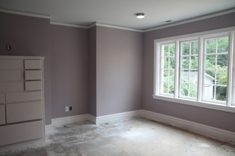
If you look through Pinterest and swoon over the beautiful wall colors, you'd sometimes be surprised when you see those colors on the paint chips (the cards usually in a big display case in your paint store). They are usually much less vibrant than what you'd expect, but instead very muted. Many have a gray undertone to them. I know this by experience. Let me tell you about my first experience trying to pick out a blue paint color for my bedroom. I knew the look I wanted. I had been seeing these beautiful, calming blue rooms on the internet, tv, and in the magazines and I wanted that look. So, I went to the paint store and started bringing home blue paint samples. They just weren't right. They looked on the paint chip like the blue I was trying to achieve, but on my wall it just wasn't giving me that serene look I was going for. I finally, on a whim, picked up a sample pot of Benjamin Moore Quiet Moments (you can see a swatch of the color below).

Benjamin Moore Quiet Moments
As you can see in the swatch, this is not a color that completely reads blue, there is a lot of gray in it. But…. this was it! I finally had that calming, serene feeling I was going for. You can see below a picture of this color in my bedroom. It definitely looks blue when it's on the walls (even more so in person). This is the reason I wanted to share this information with all of you, so you don't have to go through the headaches I did trying to find those magazine worthy paint colors. Keep reading and I'll give you an easy way to get this right.

Bedroom painted with Benjamin Moore Quiet Moments
If you're thinking, that sounds great, but how am I supposed to get this right, I do have a tip. I am going to tell you what I know from my experience, which is with Sherwin Williams paints. Since I've painted my bedroom, I've painted numerous pieces of furniture, many more rooms, and have helped friends and family pick out paint colors. When I open up my Sherwin Williams paint deck, I immediately go to a section called Fundamentally Neutral and I almost always pick a color from this section. This has these neutral, serene colors in all shades already grouped together for you.
Most paint retailers (even the big box stores) will often have the paint decks for other brands behind the counter. So, if you are trying to pick a paint color and don't want to go to a Sherwin Williams store, you probably don't have to. Also, other stores can normally mix colors from other brands, so don't dismiss a paint color because it's not the brand you're buying. They normally will only need either a paint chip, or the color on the paint deck to mix the color.
So, if you can get your hands on a Sherwin Williams paint deck, in the front there are two sections Essentials and Fundamentally Neutral. I would recommend that unless you want a pop of color on your walls, to pick a wall color from these sections. If you are looking for a white or gray color, you will find those colors in the Essentials section. All other colors are in the Fundamentally Neutral section. If you are looking at the paint chips on their wall you can go by the numbers. The Essentials are7000-7083, and the Fundamentally Neutrals are from6000-6280.
Below I've included some pictures of rooms with colors from this Fundamentally Neutral section (there are some that are only links, I apologize for this. I'm working on getting permission to showcase photos with these colors). By keeping with a muted color, you can have color on your wall, but it is not overpowering. I also have a board on Pinterest labeled Sherwin Williams Paint. This is jam-packed full of almost 400 Sherwin Williams colors, some neutral and some not. You can click here to see the board.
Sherwin Williams Rainwashed

Image by Jimmy Nash Homes via Houzz.com
Sherwin Williams Tradewind

Image by Case Design and Remodeling Indy via houzz.com
Sherwin Williams Samovar Silver
Click on this link to view a room painted with Sherwin Williams Samovar Silver
Sherwin Williams Krypton

Image by Pine Street Carpenters & The Kitchen Studio via houzz.com
Sherwin Williams Contented
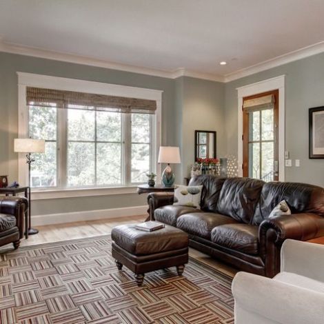
Image by William Johnson Architect via houzz.com
Sherwin Williams Sea Salt

Image by Echelon Custom Homes via Houzz.com

Image via Housetweaking.com
Sherwin Williams Austere Gray
Click on this link to view a room painted with Sherwin Williams Austere Gray
Sherwin Williams Svelte Sage
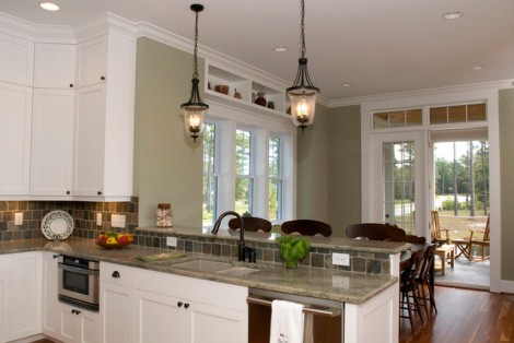
Image by Blue Sky Building Company via Houzz.com
Sherwin Williams Softened Green
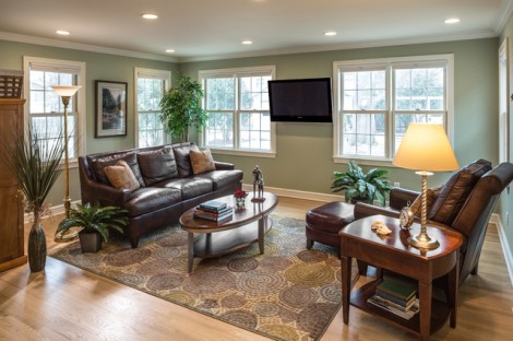
Image by S. J. Janis Company, Inc. via houzz.com
Sherwin Williams Ivoire

Image by Tina Kuhlmann via houzz.com
Sherwin Williams Netsuke
Image by Guidi Homes via Houzz.com
Sherwin Williams Veiled Violet

Images via Color Chic
Sherwin Williams Chaise Mauve
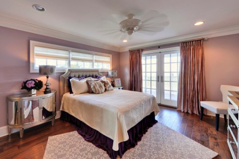
Image by Echelon Custom Homes via houzz.com
#2 Rule of Thumb for choosing the right paint color
Find a few colors that you like, pull out the paint chips and lay them down next to each other. It's amazing how you really notice how different they are when they are right next to each other. Pull out the ones that you thought you liked when you picked it out, but now that you see it next to others it's not so appealing. AND… you have eliminated a few options. Score!
#3 Rule of Thumb for choosing the right paint color
Once you find the ones you like, take them home. The lighting in a room can make a HUGE difference. Don't be too hasty to eliminate everything in the paint store because you may get one home and realize it looks better in your living room than it did in the paint store. Take a look at the color in all lighting conditions, day and night.
#4 Rule of Thumb for choosing the right paint color
Almost always go one shade darker! Find the shade that you like on the paint chip, and then go one shade darker. I have made the mistake a million times of getting the shade that I like on the paint chip, getting it home and it's too light. More saturation in the same color family is almost always better than less. The exception to this rule is when the color you want is a dark color (at the bottom of the paint chip). In this scenario, you'll normally want to go one shade lighter. I do not have as much experience with dark colors though.
#5 Rule of Thumb for choosing the right paint color
Once you have eliminated a few that you don't like in your lighting, go back to the store and pick up samples of the ones that are left. This is a VERY important step. You may have liked it on the paint chip in a very small dose, but when you get a large swatch on your wall you may find it's not so appealing. Trust me, it is much better to spend $5 on a sample quart (that's the price at Sherwin Williams) and find out you don't like it, than to buy a gallon or two, take the time to paint, and then decide you don't like it. DO NOT skip this step.
Last, but not least: My favorite painting supplies
These are a few of my favorite painting supplies. The first one I'm going to share is my ABSOLUTE FAVORITE! I have to admit, the day I got this, I was like a giddy little kid. I have used this product for about 6 years now to paint furniture, cabinets, built-ins, trim in multiple houses, doors, etc. It has been a few years since I bought mine, so this is a newer model, but this is very similar. I'm a bit jealous. Mine does not have a battery pack and I always wish it did. This is an airless sprayer, it sprays evenly and leaves a smooth, professional finish.

Graco 16M886 Paint Sprayer ProShot II
I have painted many, many rooms in my 41 years of life. I just like to paint. Confessions. I don't tape. I find that with tape (every kind I've tried), I end up with paint bleeding under the tape. For me, I get the cleanest line with a nice edging brush. My favorite are the Purdy angled brushes, like the one below. I like 2″, but that's my personal preference.

Purdy 144152320 XL Series Glide Angular Trim Paint Brush, 2 inch
Dropclothes are an essential when painting. I have made the mistake a few times of thinking I'm going to be very careful and I won't drip. I am always wrong!

Simpli-Magic 79196 Canvas Drop Cloth, Size: 6' x 9', Natural
These paint pails are great, especially because I use a brush to edge. They save a lot of bending over and rewetting the brush. These are probably my second favorite painting supplies. The liners are an essential. No clean up you just throw it away.

Bercom 2500-CT Handy Paint Pail, 1 Pack, Red

Bercom BER-2520-CT INC 6PK Handy 2520-CT Paint Pail Liners, 6-Count, Clear
Good luck finding your perfect paint color! I hope I've bestowed some wisdom that might help. If you'd like to see any more things that I have to share please like my Facebook page or follow my blog via wordpress or e-mail (below). If you would like to see what inspires me you can follow me on Pinterest.
Rebecca
Source: https://www.simplymadebyrebecca.com/2015/01/03/the-1-rule-of-thumb-for-picking-the-right-paint-color-for-your-wall/
